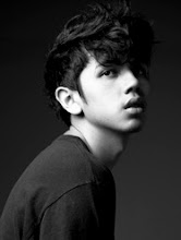
Anyway, it was my first time working with then relatively new model, Pauline. She instantly became a favorite. She's a natural. For real. And I've even used that word to describe anyone before. She just has FASHION written all over her.
Definitely one of my favorite editorials so far.


Photographer: BJ Pascual
Stylied by: Daryl Chang
Art Direction by: Vince Uy
Make-up by: Archie Tolentino of Maybelline New York
Hair by: Lance Vasquez
Nails by: Leonaliza B. Hernandez of Nail Spa
Model: Pauline Prieto
Stylist's Assistant: Mandi Garcia
Shoot Assistatnts: Carie Aguila, Glorilyn Salvatierra
Wow, it's only been 5 years since I bought my first issue of Preview, which was their 10th Anniversay Spectacular (I still have the copy with me, complete with the Swarovski crystals on the cover!). It was the thickest local magazine i've held back then. all 10 cover stars had their own full-blown editorial inside the magazine. Back then it was the most fantastic thing I've ever seen on this little side of the world. A lot can happen in 5 years pala. Now, I'm actually shooting for them. Grabe. Thank you.


10 comments:
this is my favorite as well.. parang andami mong makikita sa isang photo.. details. textures. colors,, depth!
yer the perfect man for this job!!
gandara! this is v different from your works that i've seen before. nung nakita ko to nagulat lang ako. gandara park!!!
I still remember that Swarovski Preview. Yeah you told me 2years ago, that that was your first preview. 5years palang pala yun? Infairrr.. ang bata ko parin. LOL!
AAWARDAN KITA SA ED NA TO AND ALL YOUR WORKS SO GANDARA I CAN"T EVEN. THAT'S ALL THANK YOU
One of my favorite editorials on Preview (I'm not being biased, haha)! Amazing job, BJ! Can't wait to see the rest of your work :)
she needs to work on that mouth. too much teeth. parang rabbit. Most of her photos are too upper toothy
Anonymous: Haha. It's the look we were going for. That whole Lara Stone/Georgia May Jagger thing. All about the lips and the jagged teeth. Vince, the creative director, wanted her chin up and mouth open the whole time :) so if anything, it's not her fault.
Her face looks exactly the same in all the pictures. It's not about being inspired anymore, it's about "Oooh this looks good I wanna do this too". Completely repetitive and uninspired.
But on to the good stuff: composition is excellent. The colours, textures and lighting work together; You've captured a post-apocalyptic mood nicely.
Anonymous: I get what you mean with the "i want to do this, too!", point taken. Thanks for that insight, it really had me thinking. As for the model's face. As i've said, it's not her fault but ours behind the camera.
I appreciate you taking the time to write a second comment! Thanks!
Post a Comment